Switch on trellis layout based on multi-select input
Switch on trellis layout based on multi-select input
In some cases, we don’t know exactly what form of presentation in a dashboard will work best for users. Sometimes it depends on what previous knowledge the users have on the current topic, or on the time range chosen. Especially in interactive dashboards with various choices (input elements), it is often unpredictable which data will eventually be displayed in the panels, and consequently the “best” display format is not easy to determine.
In this example we want to show how we can adapt the display format in a timechart to the selected elements. The basis is a simple search in index=_internal, which anyone can easily replicate in their environment. Since we do not know which source types from this index are of interest to users, we leave the decision to them and provide a multiselect input element for this purpose. In the resulting timechart with the search index=_internal | timechart count by sourcetype, however, situations can occur in which individual source types are virtually invisible, because the number of events of one source type is significantly smaller than the number of events of other source types. Since all source types share the same Y-axis, the common representation of very large and very small values is problematic.
Splunk helps us there with the Trellis layout, where we can split a chart based on a selected field into many small charts, each of which can then use a separate, independent Y-axis if desired. Of course, we can configure this permanently in the panel … but unfortunately this doesn’t really fit if the users have selected only one sourcetype – then we would rather have a display without trellis. In order to offer the user the best display according to the selection in the multiselect input, we activate the trellis layout only when two or more values are selected in the multiselect input.
The first part of the dashboard defines the multiselect input element, where the possible values for the source types are provided from a search ( index=_internal | stats count by sourcetype | fields - count ). The selection of users then feeds the token $sourcetype_tok$, a space is used as delimiter:
In the following part we find a hidden search, which is only used to calculate another token. This search is based on a | makeresults, to be as fast as possible. Using the $sourcetype_tok$ token from the Multiselect input element, this search calculates the multiselect field. So every time the token $sourcetype_tok$ changes, the value of the field multiselect changes as well. The line then sets another token $trellis_enabled_tok$ depending on the content of the field multiselect: if there is a space in this field ( like($result.multiselect$,"% %") ), then the token gets the value 1, otherwise 0.
The two crucial tokens are now defined, let’s look at how they are used. We can see the selected source types in the token $sourcetype_tok$ in the search of the actual chart in the filter sourcetype IN ($sourcetype_tok$) . In the result we will only see the source types that the users have actively selected:
At the end of the chart we then see the use of the token $trellis_enabled_tok$: The entry $trellis_enabled_tok$ activates the trellis layout only if this token contains the value 1. Based on the above condition if(like($result.multiselect$,"% %"),1,0) this is the case if the token from the multiselect input element contains at least one space, i.e. at least two selected values:
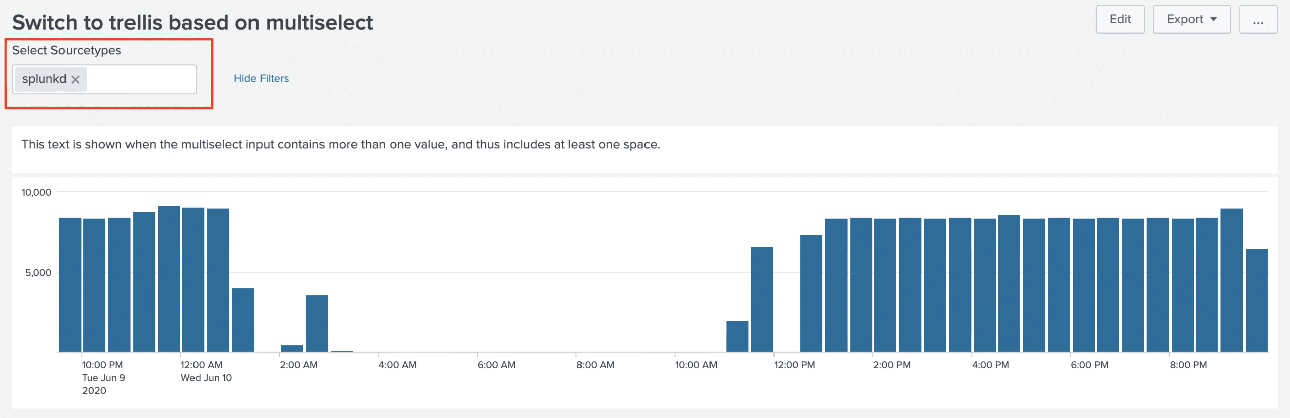
Let’s have a look at the whole thing now in the picture, first with a selected sourcetype, i.e. with the trellis layout deactivated:
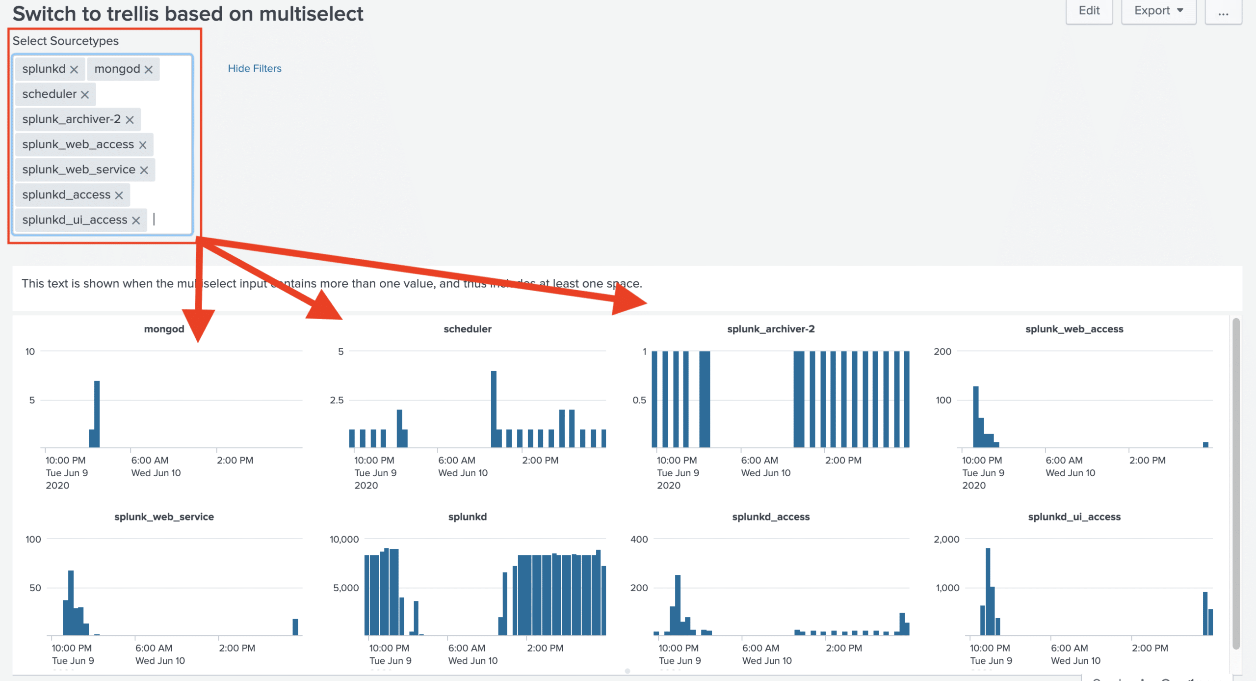
And then with several sourcetypes selected, which automatically activates the Trellis layout. We can see that the Y-axis of the sourcetype scheduler only goes up to 5, whereas the Y-axis of the sourcetype splunk_ui_access goes up to 2000. If these two values were in a single chart with split Y-axis, the sourcetype scheduler would simply disappear:
The complete dashboard will look like this:
By the way, we also offer jobs. Learn more here.